Product Image Gallery
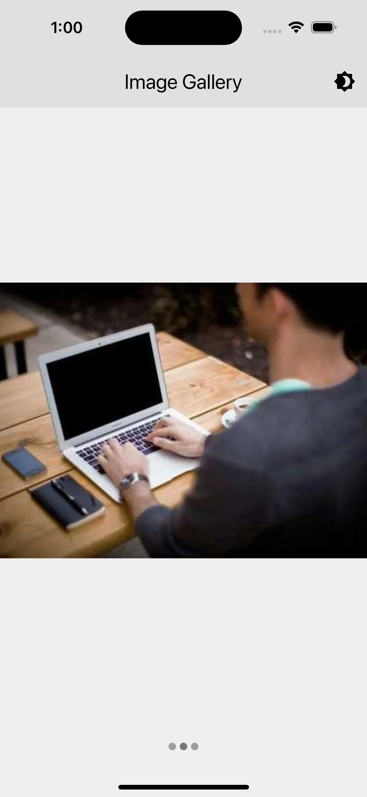
The ImageGallery widget displays a gallery of images in a swipeable format. It includes a page indicator to show the current image being viewed.
Display
Import ImageGallery in any page to display a gallery of images. It takes following parameters:
imageUrls: An array of image urls to display.

Features
- Swipeable Images: Users can swipe left or right to navigate through the images. The widget uses a
PageControllerto manage the swiping behavior. - Page Indicator: A row of dots at the bottom indicates the current image being viewed. The color of the page indicator changes based on the current page, using the primary color of the theme for the active page and grey for inactive pages.
- Automatic State Management: The widget automatically updates the current page indicator as the user swipes through the images.
- Image Loading Indicator: Displays a
CircularProgressIndicatorwhile images are loading. - Error Handling: Displays an error icon if an image fails to load.
Lifecycle
- initState: Initializes the
PageControllerand sets up a listener to update the current page. - dispose: Disposes of the
PageControllerto free up resources.
Notes
- Ensure that the URLs provided in
imageUrlsare valid and accessible. - The images are displayed using
Image.network, which requires an internet connection to fetch the images. - The
loadingBuilderanderrorBuilderprovide a way to handle image loading and error states gracefully.
Usage
import { ImageGallery } from '../components/image_gallery.dart';
class GalleryDemoPage extends StatelessWidget {  const GalleryDemoPage({super.key});
  @override  Widget build(BuildContext context) {    return Scaffold(      body: const Center(        child: Padding(          child: ImageGallery(            imageUrls: [              'https://picsum.photos/300/300',              'https://picsum.photos/400/300',              'https://picsum.photos/300/500',            ],          ),        ),      ),    );  }}